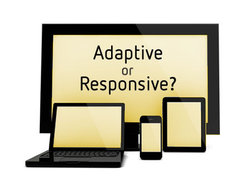
Designing an attractive and user-friendly website has been a challenge for the web designing companies. They have to pay attention to the various elements in a web page while doing this. While designing a website, there are two common approaches available, responsive and adaptive. These two terms often create confusion. However, these are completely different from each other. Whether you are working alone or with a professional web design firm, you should be familiar with the main differences mentioned below. It will help you decide the best approach for a website.
Adaptive web design dominated when responsive web design has started to gain popularity. In this approach, it is easier to design websites for different screen sizes, but it requires a lot of work. It uses a series of layouts. In other words, designers have to create a web page for standard sizes such as 320 pixels for mobiles, 960 pixels for desktop and 720 pixels for tablets. When a user accesses the website, media queries recognize the device type and loads the website accordingly. However, this type of approach is not able to survive in the future, because the screen sizes of multiple devices keep changing.
Responsive web design is gaining popularity among web designing companies these days. It uses CSS3 media queries, which can respond to any screen size. In this approach, different elements such as text and images on a web page are adjusted according to screen sizes. In the adaptive web design, these elements are not resized. As mentioned above, the screen sizes keep changing that is why this approach has become essential. There are chances that this trend will continue in future. Therefore, if you want to make your website accessible in the future, you should follow this approach.
Well, the difference between these two approaches is mentioned above. You should be familiar with these, so you can decide which approach to use.
 RSS Feed
